Should you use color in moderation in your interior decoration to remain timeless?
Not necessarily. But if you have opted for neutral shades as a backdrop (white, beige, gray for the walls, large pieces of furniture or permanent elements), you can play with touches of color without saturating the space.
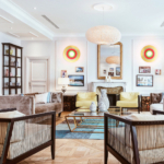
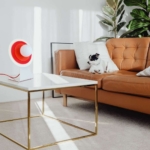
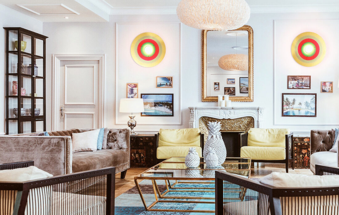
If you want to use colors in moderation, choose a few touches of color rather than a profusion. Tilt Limited Editions accessories, cushions, works of art or lighting can provide colorful accents without visually overwhelming the space.
Play with contrasts, combine bright colors with neutral shades to create visually interesting contrasts. Easier said than done ! But thanks to Laetitia, our color harmony expert, at Tilt you have the choice between three or four color variations per model to be sure to find the right match for your interior.
In general, you should stay consistent in combinations: create a color palette for the entire room or house. Repeating hues across different elements for visual harmony remains a good principle. However, when it comes to decorative elements like lamps, a more assertive touch of color will not break the harmony. You have to know how to dare to bring joy and liveliness, and to do this, colored lighting is one of the best solutions.
With the subtle and timeless choice of color harmonies of Tilt Limited Editions lamps, you can integrate color into your interior decoration, creating a balance between boldness and classicism, for an interior that remains current over the years.